hasitha.dev
My personal website and portfolio, built to document my projects, learning, and technical interests. Also serves as a sandbox for trying out new ideas in Next.js and design.
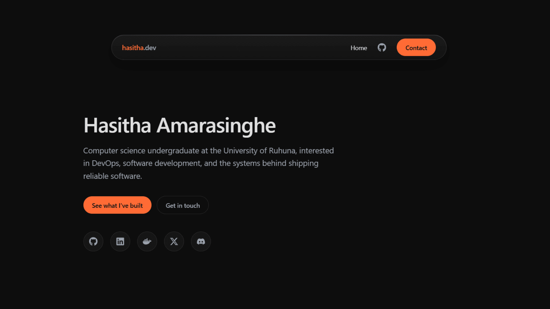
Overview
This is my personal site. Part portfolio, part scratchpad. I use it to document what I'm building, write about things I'm learning, and experiment with ideas that don't fit anywhere else.
The first version was a generic template with placeholder copy. I rebuilt it from scratch because I wanted something that actually reflected how I think about infrastructure and design, not just something that looked like every other developer portfolio.
Design
The visual system follows one rule, orange is only for interaction. Buttons, links, and hover states use it. Everything else stays neutral. Text, borders, backgrounds. This keeps the accent meaningful instead of decorative.
Status uses a separate green, and only for actual health signals. Build passing, site up. If something is amber, you know it's a warning. If it's grey, it's inactive. The colors mean specific things.
Earlier versions had a grid background and floating orbs behind the content. I removed both. The current version is flatter and more honest about what it's doing.
Architecture
Built on Next.js App Router with TypeScript and Tailwind CSS v4. Design tokens live in a single globals.css file and are exposed to Tailwind via the @theme directive, so colors and spacing have one source of truth.
The projects section pulls live data from the GitHub API. Last push, language, CI status, and commit count, and it pings deployed sites to check whether they're up. Results are cached with ISR, GitHub data refreshes hourly, site status every 10 minutes.
The contact form uses a honeypot field instead of a CAPTCHA and sends a confirmation email back to the sender. It's a small thing, but it makes the interaction feel less like shouting into a void.
Reflection
Currently working on: a proper status page that aggregates uptime across all deployed projects, and an /about page with more detail than the homepage gives.
Longer term: a writing section for notes on things I'm learning, and a case study format for projects that deserve more than a card.